
Warning and safety labels are informative labels designed to warn people about risks associated with any place, system, or product. A typical warning or safety label comes with a short information, which is then printed in bright colours to get people’s attention. It is, therefore, highly vital to factor in the effectiveness of your warning or safety labels to ensure everybody’s well-being.
In this guide, we have compiled some of the best and most effective tips to help you create warning and safety labels.
- Readable, clear writing
As mentioned before, warning and safety labels are meant to warn and keep people safe from potential dangers. As such, the content of the message needs to be kept simple, concise, and legible. The font size should be large enough such that they can be read from afar. In addition, you should use a minimalistic font design such that the font do not take away the purpose of the label.
- Use easy-to-understand languages
Besides ensuring that your writing is clear and readable, you also want to stick to an easy-to-understand language. For starters, choosing the main spoken languages understandable by those in the area where the label will be applied is vital. Additionally, you would want to use simple and easy-to-understand words to carry across your intended message.
- Select the right word signals
Each word signal carries a different weight and meaning. Hence, using the right word in your warning and safety labels is vital in carrying out the intended message. For example:
- Caution indicates that the place or situation may result in severe injuries or consequences and, therefore, require a level of carefulness.
- Danger warns people to stay clear of the place or situation, which may result in severe consequences, such as death.
- Notice denotes a non-dangerous warning or message.
- Warning offers a serious cautionary statement.
- Safety instructions remind people to follow specific safety-related instructions.
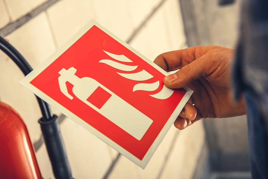
- Using the right symbols
We all know the saying, “A picture speaks a thousand words”. Hence, symbols are vital add-ons in a warning and safety label. In fact, you can sometimes use them in replacements of words. Not only are they straightforward to understand, but they are also ideal in labels with limited writing space.
- Selecting the right label material
Warning and safety labels are usually employed in dangerous environments, such as construction areas, heavy machinery, and chemical zones. Hence, it is vital to use durable, high-quality materials that can withstand harsh environmental effects.
- Colour and shape of the label
Warning and safety labels need to be highly visible in order to inform nearby people of a specific danger. Hence, choosing bright and attractive colours, such as orange, yellow, and red, can help to get people’s attention easily. Additionally, while it is not a need-to-consider feature, you might also want to think about the shape you want to use, whether rectangular, hexagonal, or circular.
Conclusion
So, here are the tips to help you design effective and precise warning and safety labels for your premises or business. With such a crucial role, it is vital to outsource label sticker printing from trusted companies, such as Hiller Industries Pte Ltd. We have been in this industry since 1981, helping various clients and businesses in designing and creating labels and nameplates using methods such as silkscreen printing. If you are considering getting professional label printing, you may reach us at https://www.hillier.com.sg/ to find out more!